The People Versus
Contents |
Host
Kirsty Young (2000)
Kaye Adams (2001-2)
Broadcast
Celador for ITV, 13 August 2000 to 18 June 2002 (115 episodes in 2 series + 2 unaired)
Synopsis
The Briggs/Whitehill/Knight threesome invented the format of the decade in the 90s with Millionaire. The BBC were very grateful for their follow-up, Winning Lines, for - despite a few illogical aspects - it quite nicely propped up their otherwise lukewarm Autumn schedule on Saturday nights. So it was interesting to see how The People Versus... affected their batting average.
Bizarrely, and probably for the first time in British TV history, The People Versus actually turned out to be two very different shows made out of the same premise (a practice that's not uncommon in past US formats). We'll take each version in chronological order.
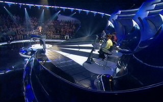 The original set of The People Versus
VERSION 1
Here's the key twist for the original show - ITV were paying for the public's incompetence (like the Licence Fee in reverse) because it was the People who set the questions. Yes, this was The People's Game Show comrade, and for every question our resident contestants got correct they won £5,000. That's eight-and-a-quarter questions on Who Wants to be a Millionaire.
The programme marked an interesting shift in that the programme was piloted by the production company using their own dosh, so the whole thing was put together much more on their terms rather than those of the broadcaster (the side of the equation than normally provides the bulk of the equity for the pilot show).
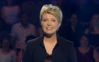 Host for incarnation number 1, Kirsty Young
Viewer interactivity was at the fore, and Kirsty "don't laugh at my name when I'm a pensioner" Young made it very clear that it was The People who set the questions and yes, it really could be you sitting there trying not to make a fool of yourself. Surprisingly, it wasn't a £5 a minute phone number being used for players to give questions. In fact they could do it free over the internet if they wished.
But what of the contestants? For the first show, 100 people were auditioned, and of those three people were picked to play against the world by nominating five specialist subjects which the population could pitch questions thereat.
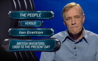 We're gonna git you, sucka
And so, to the rules
The rules were like this: In each round the players were shown five questions from one of their specialist subjects. In Round One, each contestant HAD to attempt and answer correctly one of those five questions - "one of five to stay alive". In Round Two, on a different subject they had to answer two correctly to stay in, Round Three three, Round Four four and finally in Round Five they had to answer (yes, Einstein, you've guessed it) all five. In each round, the player could, if they wanted, earn more cash by answering more questions than the quota required, again for £5,000 a piece.
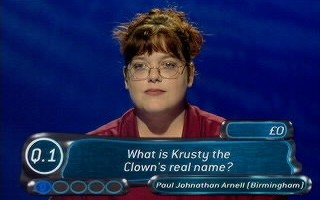 The one Q in the bottom-left means only one question needed to be answered correctly in this round
To help, each player was shown all five questions at the start. Each player was also given three 'flips'. If a player wanted to use a flip, they could substitute any of the five given questions for another one. Also, if they had the cash, they could elect to 'buy' answers to questions at £10,000 a pop. Costly, but it kept them in the game. Sadly, they elected to call this feature "Cash for Questions", which even then was several years out of date to be topical, neither was it an original idea for a game show (see Noel's House Party, of all things).
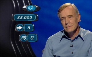 This graphic recaps on the round number, the cash banked to date, the number of flips and the number of answers that could be "bought"
If they went for a question and they got it wrong, not only did they lose all the cash they earned in that round, but their game would be over and their seat would have to be re-assigned at the beginning of the next programme. But it didn't go to just anybody - oh no - the person who took the failed contestant's place was the person who set the question. Excellently, sometimes that player was hanging on the end of the telephone line, hopefully (for our studio contestant) to say "unfortunately, that's the right answer." Yah boo sucks!
Should a player manage to make it through to level 5 and win, they had the opportunity to rearrange their topics. And that was it. Personally, we'd have preferred something a bit more sophisticated - maybe changing one of the subjects, perhaps.
Values are everything - aren't they?
As you'd expect, the production values were excellent. Special mention went to the very Terminator 2 metallic computer graphics (which nearly worked on Raise the Roof, but here they ran with the motif much more) that popped up bearing the questions and the various player stats. We weren't sure the 'shape' of the graphics was meant to be in the shape of anything in particular, perhaps an elongated squashed tomato. A metallic elongated squashed tomato. The typeface was just the italic version of the Millionaire font.
Also special mention went to the set - it was very stylish with an excellent rotating host desk (technical term: pod) so it pointed towards whoever the questions were being fired at. The lights also made a path towards the contestant in play too, blacking out the other two.
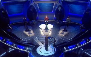 Kirsty revolves around to the next contestant
However, there were some ways in which the lighting just grabbed too much of the attention. For some reason, when a player started their game the camera insisted on spinning round the audience really slowly. The idea, we think, was to show off the fact that they could do a 360 pan around the studio and yet - da, da, daaaa - you couldn't actually see any cameras. (They were actually hidden behind some one-way glass between the contestants). However, this just didn't work from a viewer's point of view - we just wanted to get on with the questions. Why did we want to look at the audience, pray tell?
 That oh-so-necessary reverse angle
The futurogoth mood music wasn't loud enough, but this is more of a compliment to the Strachans' excellent musical talent than it was an actual criticism of the show.
And now, the opinion bit
So, all the above said, you'd expect this to be a glowing review? Sadly, no.
Cardinal sin #1 - Introduction of false tension. This was attempted to be added by Kirsty making sure, in the Tarrant style, that they definitely want to 'light the question' when it was picked, which committed them to answering that question. Presumably this was meant to mirror the "going orange" effect in Millionaire. Instead, it just added yet another step in the process of actually getting to the point of answering the question and it was very very annoying.
In fact, in general we were annoyed because of the overall lack of tension the show induced. Despite offering the chance to win unlimited cash, the most anyone could jeopardise in one round was £20,000 by answering four correct and blowing the fifth. Clever strategists could have also put their strongest categories for Rounds Four and Five which they were going to be the bees knees at. This did mean a general lack of shock value. We all like to see someone win the Million on Millionaire, but how many of us also want to see someone get to £500,000 and blow it? If you were being honest, quite a lot of you. The only sort of shock we were likely to see is if someone was really cocky trying to answer a question only to get it wrong.
And let's not forget that they had flips and buy-outs at their disposal too. Maybe it would have been better if they'd just stuck with one of these elements - if it were us, we'd have probably allowed players to buy answers but for an increasingly larger sum each time. That would be really nasty...
Cardinal sin #2 - Not giving all the answers. In a feat of jaw-dropping callousness, the answers to the questions that weren't used were originally not revealed. This was just bad, bad, bad. We guess that they originally thought that it would have just slowed things down even more, but you couldn't get away with teasing the British Public with some (it must be said) interesting questions and then not tell them the answer. Even if there wasn't enough time to go through them on the show, you'd have thought someone would have had the bright idea of at least putting the answers on the web site?!? But no. (At the time we thought that if they did this for future shows, we'd gladly take the credit. They did, so we will.)
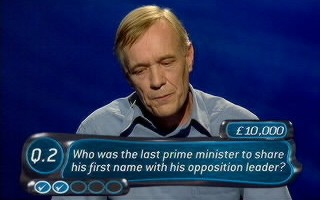 An unanswered question from the 2000 series. It's John Major, by the way. You can get some sleep now.
One other thing that wasn't clear is who was choosing the questions? As it stood, it appeared there was nothing to stop the producers from choosing easier or harder questions to please their whim (and their ratings). When we first heard of the show, we wondered what would stop anyone from asking a really obscure question. We kind of hoped that they would have found a clever way of getting around this, but sadly it seemed not to be the case.
Cardinal sin #3 - Poor pacing. But all the above criticisms were mere trifles compared to this real entertainment killer. If we were to describe the show in one word, that word would be 'slow'. You could be forgiven for thinking that by effectively reducing the cash per programme compared to Millionaire, you could in turn increase the pace. We were hoping that maybe as many as 45 questions could be asked per programme. Well, in the opening episode nobody got a question wrong and the total amount of cash given away was £35,000.
Now, that wasn't bad going but consider this: that was seven questions answered in the entire 30 minutes of programme. (And there were 13 questions that were asked but not answered at all - see point #2). Now, with Chris Tarrant and the amount of prize money being played for we don't mind - we know he's being a git but it's entertaining gitness. With Kirsty Young we were just annoyed because thanks to the nature of the questions it really should have been a lot faster.
Summing up
On balance, the show looked really nice and it had potential interactivity and prize money. However, we criticised it because it was s-o-o-o-o-o s-l-o-w. Even accounting for this being a new show at the time where all the rules had to be explained, we were hoping for something five times the pace that we actually saw.
VERSION 1.1
As the original series went along, a number of common sense changes were made (partially thanks to this review, so rumour has it). Things had certainly improved - at least a bit.
The answers were now appearing on the web site - hooray! They even give the answers out during the programme - hooray! We got to see the same contestant two or three times a show - hooray! They didn't play up the "lighting the question" aspect any more - hooray! It was even edited slightly quicker - hooray! Even the "spinny" lighting effect had been ditched - hooray!
However, the reading out of all the categories still took far too long, especially when only a couple of them were ever used per show - maybe they should have just have a graphic with them on and just get Kirsty to read out the one that's coming next? There was also still far too little audience reaction - there were no oohs or aahs from what we could hear, and getting a question wrong was proving a bit of an anticlimax. Oh, and the music was still too quiet.
So, what started as a teeth-clenching half-hour wasn't transformed into a nail-biting half-hour but it was starting to get somewhere.
VERSION 2
The reasons for recommissioning The People Versus were not altogether clear to us, given that it was a bit of a PR disaster even if the ratings weren't half as bad as they potentially could have been.
In 2001, ITV gave it another shot, but this time it was an early-evening 25-minute format during the Summer with lower cash prizes, no audience and much less pre-publicity. And once Wimbledon finished it was in the The Weakest Link time slot! No two ways about it, you had to look at that as a bit of a Premiership to Third Division-style demotion. But was the new show any better? "Yes, but..." is the answer.
A few motifs remained constant from the original version of the show. The five round structure with 1, 2, 3, 4 and 5 questions required was the same, although the questions were now basic general knowledge. These were still sent in by the public, bless 'em. The three flips were still here, more of which in a moment.
The excellent graphics package returned from the first version, as did about one third of the set plus "The Egg" - a kind of see-thru ovoid tube that they didn't use in the original set. It was rather nice, particularly the edges which appeared to strobe in an interesting way. They also kept about half the opening sequence (losing the lovely, dramatic close-up towards the contestant's eye, Interceptor-style) and most of the sound package.
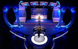 The Egg. A very nice egg too.
The host was still Scottish and still a woman. This time around it was Kaye (Public Property) Adams. The one key skill she seemed to have that Young didn't was a sense of building a warm rapport with the contestant, and it did make a heck of a difference to the feel of the show. Another new feature was a string of puntastic couplets that were thrown in occasionally ("The further the rounds, the greater the pounds"). Thankfully, Adams cracked on with the job with remarkably little preamble ("Quiz me quick is my motto," she said).
Contestants now faced a time limit of four minutes to cover all five rounds of the game. While a round was in progress, the contestant was offered up to five questions in their attempt to reach their target. They were shown a question and offered the chance to answer it, pass it or flip it. Correct answers progressed the contestant towards their quota. Passed questions cost only time, but the five-question limit meant that contestants could only afford to pass a limited number of questions in later rounds before being forced to guess or flip. If the contestant elected to flip, the question offered was thrown out of the game and replaced by a question in the contestant's pre-selected specialist subject.
Upon completing each round, the contestant was given a chance to quit with the money they'd earned so far, or to face the next round. The money tree went £100 for round 1, then £250, £500, £1,000 and finally £3,000.
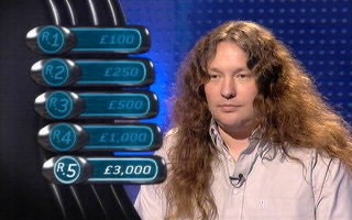 There's nothing like a screen grab to ram home the point of the previous paragraph
If the contestant completed round five, they banked that £3,000 and the game began all over again: four new minutes, three new flips, no difference whatsoever. This seemed to be a shame as there was nothing to stop a particularly dominating contestant answering question after question, racking up three thousand nicker each time, with no limit and very little variation in the run.
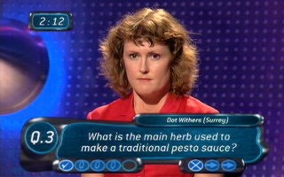 Round 4 in progress: three questions need to be answered but there are two flips remaining
Apart from this, the quiz was reasonably well-designed, interesting and a lot more exciting than Version 1.1. It also looked and sounded good. It must be emphasised that many of the previous pitfalls had been avoided: they showed all the answers, they didn't waste time messing around with pointless camera pans and they got through lots of questions. There were as many questions answered in the first three minutes episode one of this version as there were in the entire first episode of the original.
So far, so good... but the "fun" started when the contestant got a question wrong...
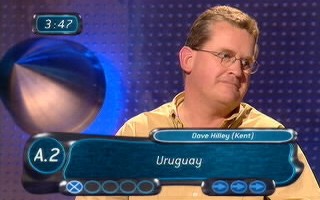 Top comedy moment: a contestant gets his very first question wrong
First of all, the member of the public who sent the question in earned £100. Second, the game ended immediately. Third, the contestant had to play what was not a Bonus Game but, instead, a Penalty Game. In other words, they had to defend the money they had won so far (up until the start of that round). They did this by playing The Bong Game (or Beat the Bong as it was sometimes called). Houston, we have a problem.
This made no sense whatsoever. Contestants went from playing a reasonably serious and entertaining quiz to playing one of the hoariest, most luck-based and least logical RADIO stunts of all time. As soon as this element was revealed, well... let's just say there weren't many dry eyes around the office. As completely illogical and badly-fitting game elements go, it truly ranked up there with the likes of Chain Letters' Tie the Leader and the scoring in Keynotes.
Do we have to explain The Bong Game? Oh, alright then...
A monotonic, disembodied voice read out erratically increasing sums of money, starting just above zero and going up to the amount that the contestant was trying to defend (£100 if they failed in Round 2, £250 if they failed in Round 3, £500 if they failed in Round 4 and £1,000 if they failed in Round 5). At some point during this series, there might be a mighty Bong.
If the contestant stopped the voice before the arrival of the Bong, the contestant took home the last sum of money mentioned, and any money left over was given to the home player who set the question. If the Bong beat the contestant, the studio contestant did not win any money (save for any £3,000 lumps banked) and the member of the public won all the money in play for that round.
To add to the jollity, contestants had a choice of three different Bong games, one of which was a Bong-free zone, and so offered a sufficiently brave contestant the chance to win back all the money that they had successfully earned in the last round.
Let's play The Bong Game now (to defend £1,000). Choose a game:
Bong Game 1
Bong Game 2
Bong Game 3
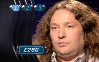 Take the money! Take the money!
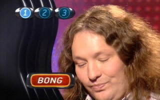 BONG! Sorry, you lose
There is no objection to The Bong Game as such. It would be a fine bonus game for, say, a hypothetical new version of Beat The Clock. But it was sorely, painfully misplaced here. Quiz show players didn't look happy playing it. Kaye Adams didn't look happy hosting it. There are only three vaguely credible ideas why the powers that be decided to include The Bong Game into a quiz.
Theory #1: "They did it for a bet"
Theory #2: "They're making so much profit from Millionaire they used People Versus as a means of getting into a lower tax bracket"
Theory #3: "A version of the Millionaire principle started as a game on Chris Tarrant's Capital FM radio show, so if that worked well why wouldn't another such stunt - The Bong Game?"
Stunts such as the Bong game worked marvellously well on Tarrant's radio show because it was driven by Chris's rapport with the contestants which helped heighten the tension. Here you had a competent quizmaster and a disembodied voice. Not gonna happen.
The first few shows proved that the rebalancing of the main game mechanics was largely successful, but many other people we spoke to similarly questioned why The Bong Game was welded on for no good reason whatsoever. This was particularly the case when they were playing to keep hold of £100. Big deal. The show either needed a bit more work or rejecting as a bad job.
The much-vaunted "interactivity", supposedly so desirable in game shows these days, is a surprisingly hard thing to capture in a world where pre-recorded programmes are the norm. Never mind, third time lucky, eh?
Catchphrases
"One of five to stay alive"
"The further the rounds, the higher the pounds"
"The more you know, the further you go"
"Why flop when you can flip?"
Trivia
One of the contestants in the daily version of the show was Michael Cule who won £1,000. Who he? He played Brother Mace in the legendary Knightmare. Future Egghead Steve Cooke won £12,900 on his episode.
The set cost a staggering half a million quid - and to put that in perspective, spending fifty grand on a set would normally be considered rather extravagant. It was and is the most expensive set ever designed for a quiz show and is rated by designer Andy Walmsley (Millionaire, Pop Idol, Ice Warriors) as his favourite of the many sets he's created.
The last remaining 2 episodes from the Kaye Adams version aired on game show channel Challenge TV when it was airing the all of the Kaye Adams version episodes.
Inventor
David Briggs, Steve Knight and Michael Whitehill
Bong Game devised by 95.8 Capital FM
Theme music
Keith and Matthew Strachan
Web links
Celador's The People Versus Page
Andy Walmsley's set design pictures (Primetime)
Andy Walmsley's set design pictures (Daytime)
Pictures
 The edges of the egg strobed in an interesting way.
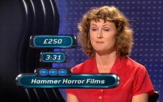 'The recap screen.
